What is PRICEPhysics™? – The exact science of pure natural price action presented in High Definition, unburdened by lagging indicators or chart structures that, at best need to be interpreted to have any value to a trader or investor. Allow me to prove it to you.
All charts are constructed with specific but imprecise bar data. These types include.
Time Based Charts – Charts where each data point is generated from a fixed period of time. There are three common types of charts plotted using time charts.
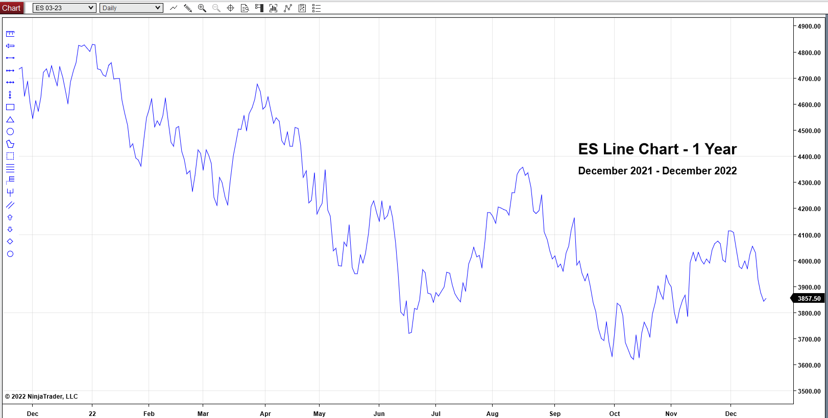
Line Chart – Simple a line generated by plotting just the Open, for example of each bar generated from each time period.
I call this a “Dead Fish” chart. It flops around aimlessly.
Time charts are constructed using the following pieces of price data.
Opening Price
Highest Price
Lowest Price
Closing Price
With these data points we can construct a price bar for any time period we choose.
Now think of each price bar as a container holding all of the contracts or shares traded in that bar. How much does each container hold or what is the volume of each container? Does each bar contain the exact same volume? Obviously not.
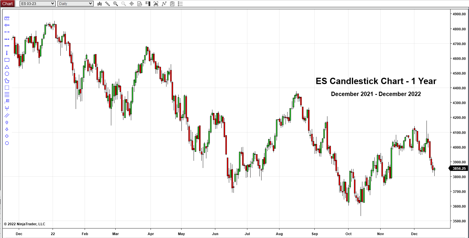
Candlestick Chart – A candlestick chart has the exact same data as a price bar chart, except that this chart has an enlarged region of the bar between the open and close of the bar. The range between the open and the close of each bar is the defining feature of candlesticks. Heiken-Ashi Candlesticks are a unique type. Heiken-Ashi means average bar so it would be expected that this should produce a smoother candlestick chart.
Now again, think of each price bar as a container holding all of the contracts or shares traded in that bar. If a candlestick chart is supposed to give us more detail, how does it accomplish that if the volume of each bar is completely different? Obviously it can’t.
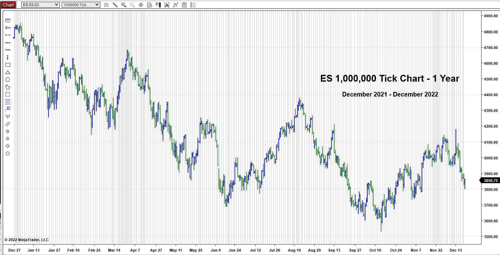
Tick Charts – Here a tick is a transaction. (Do not confuse a transactional tick with the NYSE $TICK.) A chart is created by the user choosing a specific number of ticks per bar.
Now again, think of each price bar as a container holding all of the contracts or shares traded in that bar. How many contracts or shares are in each transaction? A transaction could be a single contract or share or 1000 contracts or shares. Does each bar contain the exact same volume? Obviously not.
Price Only Charts – Charts where each data point is generated simply from price and only moves when price moves. There are currently two common types of charts plotted just price . . . and indicators.
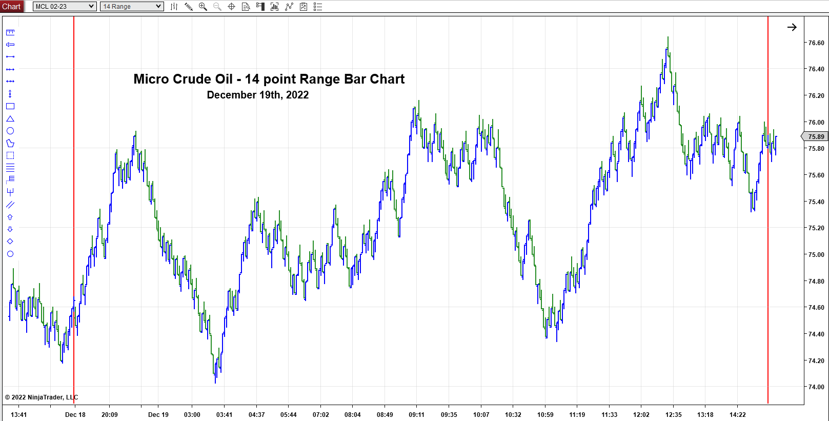
Range Bar Chart – A range bar chart is where every bar will end once the range between its high and low equals the chosen range. meaning, every bar will have the same bar range. In addition, every bar will close either at its high or low. Once a new high or low is established, then a new bar is created. Also the range bar is the only “Price Only Chart” plotted without any regard to time. Remember this point.
Again, think of each price bar as a container holding all of the contracts or shares traded in that bar. How many contracts or shares are in that defined range? Does each bar contain the exact same volume? Obviously not. Are you beginning to see a reoccurring problem with these charts?
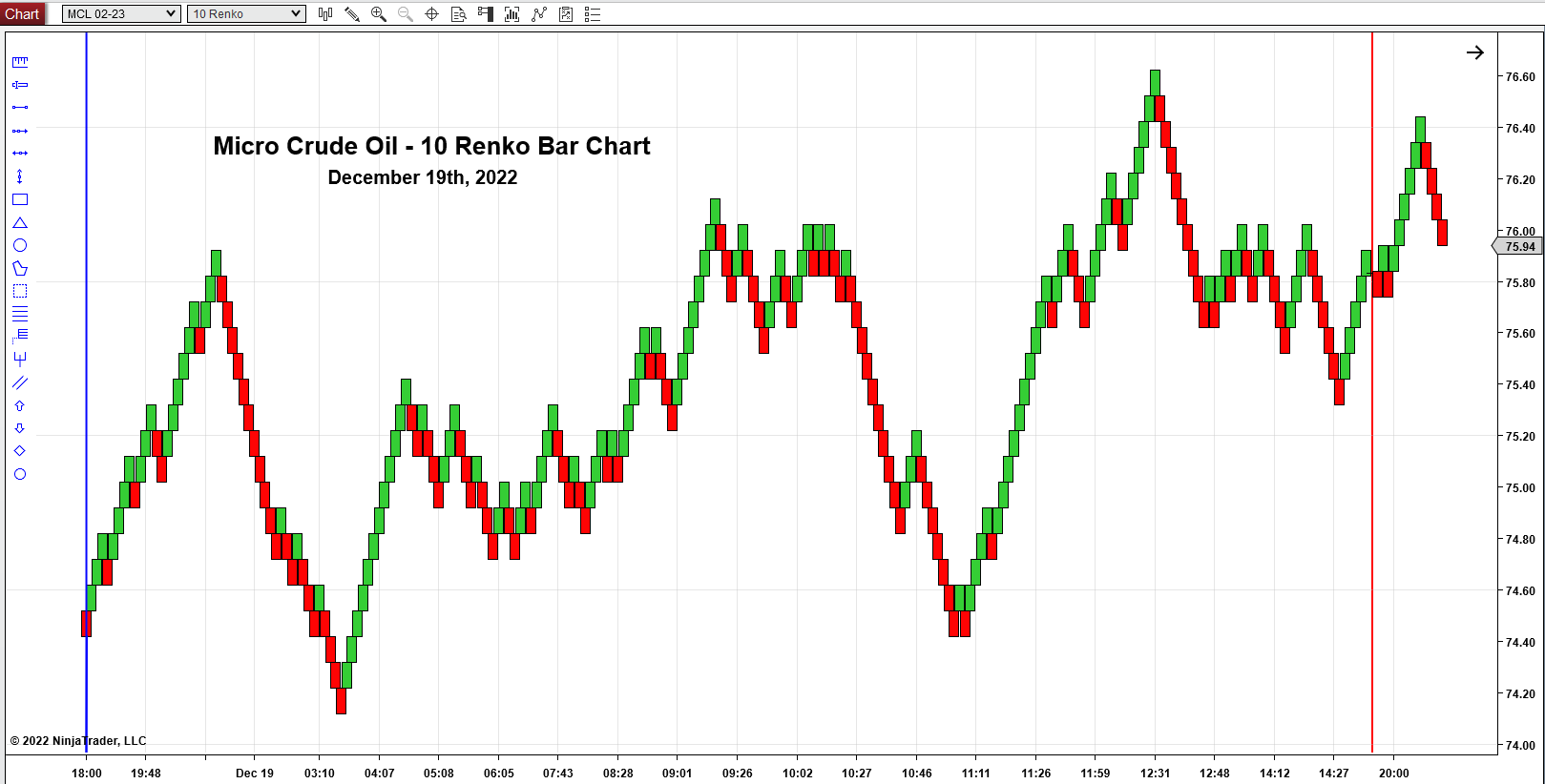
Renko Bar Chart – A Renko chart leaves no room for bar or pattern analysis. It’s only value is at highlighting longer term trends. So it has to be used alongside other charts as a guide in showing trading direct.
Why should we have to use a second chart to tell us what the 1st chart couldn’t tell us? Is someone purposely making this hard for a reason? Obviously no, they just don’t have a clue what they are doing.
Volume Bar Charts – A volume chart is created where the user defines the volume amount of each bar on a chart. There are three common types of volume charts.
Volume Bar Chart – Some platforms cut off the volume when creating each bar. If a transaction is split between two or more bars, some platforms will either stuff the leftover contracts or shares into one bar or just inaccurately build the bars. These are NOT constant in their construction.
Equivolume Chart – This chart type is a hybrid. It is a time based chart that displays volume by making the price bars wider.
And again, any chart environment that isn’t straightforward and easy to understand, comprehend and implement. . . stay away from like the plague. I swear the people that come up with this stuff were drunk.
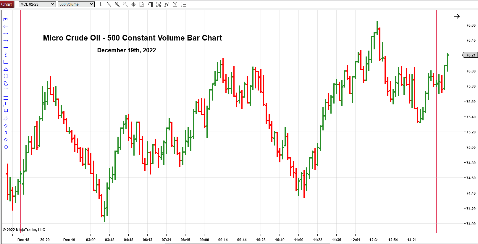
Constant Volume Bar Charts – A Constant Volume chart is created where the user defines the volume amount of each bar on a chart AND ever bar on that chart SHOULD contain the exact same amount of volume as the one before it.
A Constant Volume Bar Chart is the visualization of pure natural price action because it displays a perfect marriage and balance of price and volume. Nothing to interpret or guess. (see video comparing Constant Volume Bars to Time Charts) Constant Volume Bars are the only chart environment to display natural support and resistance levels accurately. YOU control the speed of the chart. If you like scalping, create a fast chart. If you like day trading, create a fast one, a slow one or one somewhere in-between. If You like swing or position trading, create slow or super-slow charts. You are in complete control. You have all of the information the market has to offer and no need for lagging inaccurate indicators!
Constant Volume Bar Chart advantages over traditional Time-based or Price-based charts alone.
- Time charts are made up of bars that each carry different volume. This means you must apply a volume indicator and then interpret how that volume is affecting the chart at that moment. Then each separate indicator you add to your chart, DECREASES the efficiency of what you are being shown on the chart, IT DOES NOT INCREASE IT! Why Are traders and investors always making this process harder than it needs to be.
2. Price Charts
-
- Range Charts are based solely on a specific user-determined price range. Volume is ignored. This means two things; 1st during periods of consolidation your trades are chopped up mercilessly. Second, a new bar is only created when price breaks out up or down so you are losing the initial push in price toward breaking through a top or bottom.
- Renko Charts has no value to trade itself because it only highlights longer-term trends.
- Point & Figure, Kagi, and Three Line Break charts all require indicators and other “helpers” in order to interpret those environments in order to trade. This is completely illogical.
CONSTANT VOLUME BARS VS. THE WORLD
How does PRICEPhysics™ make Constant Volume Bar charts even easier to read and understand?
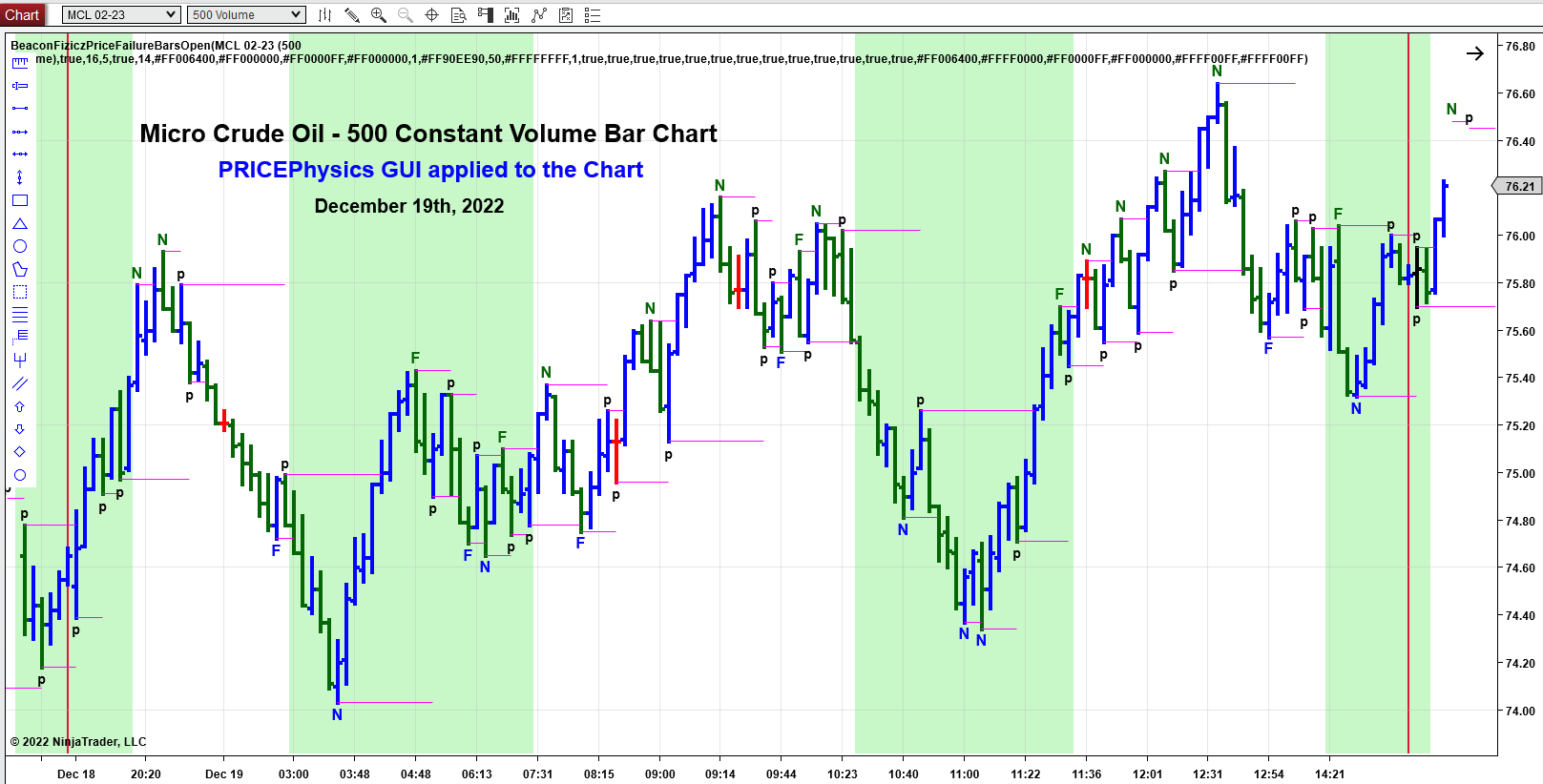
PRICEPhysics™ takes the pure data points that are displayed on the chart and adds the embedded information contained in the bars as prints them on the chart as a guide. These are natural points of support (bottoms) and resistance (tops) These are NOT manufactured lagging indicators. Yes, all of the information you see on the screen in the GUI are data points taken directly from the price and volume data points on your chart uniquely.
PRICEPhysics™ GUI components:
-
- N – Price making New Price Highs of resistance or New Price Lows of support. This label is displayed as soon as the bar following the New High or New Low (confirmation bar) has closed.
- F – Price failing to make New Price Highs of resistance or New Price Lows of support compared to the last N (New High or New Low). This label is displayed as soon as the bar following the “F” bar, Failed New High or New Low (confirmation bar) has closed.
- p – Price pulling back between New and Failed Lows or Price pulling back between New or Failed Lows. This is simply price’s way of showing it taking a breath as it moves higher or lower.
- M – Price exactly matching the previous labeled data point of support or resistance. Matches seem to attract price back to that data point.
- Background Color (Trading Trend) –
- The background color changes once an established “F” of resistance is breached. This will turn the background color from Green to White.
- The background color changes once an established “F” of support is breached. This will turn the background color from White to Green.
- Michael Covel, the self-appointed Trend Master on the planet and I used to get in arguments all of the time. When I would ask him to “DEFINE” the term Trend, he repeatedly and continually refused. The reason he refused was because, he couldn’t define it. I’ve always believed if you can’t specifically define a trading tool, it is worthless. Well, I have specially documented it and defined it for over 20 years. Sometimes Chart Trends last for an extended period and sometimes they turn on a dime. The benefit of PRICEPhysics™ is that you can see it occur in real time. If you can SEE IT, you can CAPITALIZE and PROFIT from it. Chart Trends ONLY OCCUR on THE chart you are trading. These trends do not migrate to other charts. This is one of the things that makes PRICEPhysics™ so amazing. YOU are in complete control of your trading and charting environment.
- Red Bar – Neutral Bar where the opening price of the bar is the same as the closing price of the bar. This shows a trader that a large block of contracts or shares traded and closed all at the same price. This usually telegraphs a short term change in price direction.
- Black Bar – I call this a “blow out” bar because this bar creates a labeled data point both at the top (resistance) and bottom (support) of that particular bar.
- Session Break – Market Close at 5 pm EST.

